It is tough to miss the increase in attention that User Experience (UX) is getting these days. It is the focus of many digital marketers and with good reason. Simply put, your business will not thrive and grow without a good user experience.
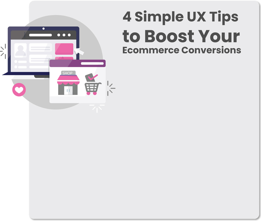
In this post, you’ll learn how to create brilliant UX for Ecommerce sites. This will lead to better SEO results, a higher conversion rate, and more sales.
The importance of UX
Not sure that user experience holds that much weight in the world of Ecommerce? Check out these eye-opening UX statistics:
- 94% of online shoppers do not trust a site that appears to be outdated
- 85% of adult mobile shoppers believe a company’s mobile website should be as good or better than its desktop version
- Poor site usability is at least partially to blame for 70% of online business failures
- Worldwide, 440 million people use adblockers and ads impeding the user experience is the reason given by nearly all of these people
- 53% of the time, mobile shoppers will leave a page that takes more than three seconds to load (the average mobile site takes around nine seconds to load)
- 70% of online users say they pay more attention to bulleted lists than paragraphs of content
Ensuring visitors to your company’s website have an excellent user experience needs to be high on your list of priorities. If you are not sure how to accomplish this, read on.
Four keys to a great user experience
-
-
Your website design
The phrase less is more does not just apply to grandma’s bright red lipstick. Websites with intrusive ads, confusing graphics, and a mashup of fonts will not make a visitor want to convert. This will make them bounce as fast as possible.
- When considering your website design apply the principles of Jakob’s Law of the Internet User Experience. People who use your website also use other websites. These people prefer to use sites that work in a similar manner. Think about the internet giants, their pages function in approximately the same way. Their icons are familiar and located in about the same area on pages; an example of this is the shopping cart in the upper right-hand corner of most retailer’s pages.
You may have brilliant design skills but fight the urge to fill your site with an overwhelming collection of graphics.
- Even though you want your web pages clean and easy to read, you still need to put a unique spin on your page. A cohesive colour scheme that runs throughout all of your sites and social media along with a simple but noticeable symbol make great design options.
For example, a dog grooming business may choose analogous shades of turquoise and teal for their pages and then add a paw print logo in white. If used consistently throughout the company’s website, ads, and social media the design and colours and symbol will become synonymous with the dog groomer.
- Do not skimp on descriptions for your products. A customer purchasing t-shirts does not want to search to find out the fabric content, or if the one size fits all really means one size fits small through large sizes. Layout information for your customer as if you were seeing it for the first time. You are an expert when it comes to your goods and services, but your customer is not.
- Pay attention to how complicated your site is for your visitors to use. Is everything located within reach? Do customers need to scroll through several pages to find what they want? Remember that icons can be too close together, leading to maddening overlap.
For example, have you have experienced this aggravating moment? You have finished shopping and click on the icon meant to confirm your order. Because the icons overlap, the page receives the signal that you want to add more of the same item to your cart. You may have missed the exact spot to confirm by a millimetre, but the site does not know this. The more you try to confirm the order, the more packages of cat litter you find in your cart. Eventually, you will quit trying, abandon the cart, and shop elsewhere.
- The checkout is the moment of truth for your customer. Assuming they have had a smooth journey examining your wares, they should arrive at the checkout feeling good about their decisions.
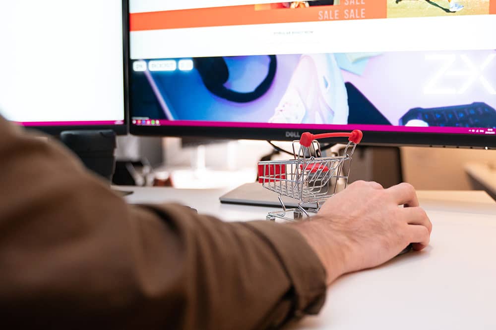
This is a good time to talk a little about cart abandonment. Approximately 76 out of every 100 shoppers click away from their cart before completing the sale. If you believe that is a considerable number of unconverted sales, you are correct. Before you can address cart abandonment on your website, you need to understand the reasons behind the practice of filling a cart and clicking away.

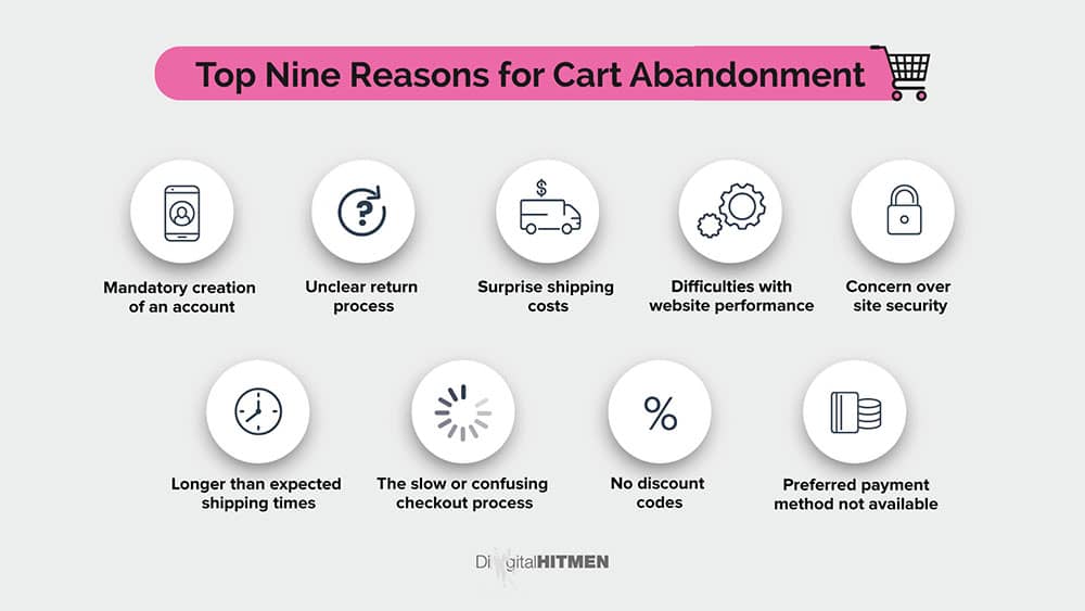
Top Nine Reasons for Cart Abandonment:
- Mandatory creation of an account
- Unclear return process
- Surprise shipping costs
- Difficulties with website performance
- Concern over site security
- Longer than expected shipping times
- The slow or confusing checkout process
- No discount codes
- Preferred payment method not available
Once you understand a few of your shoppers’ reasons for leaving their carts before purchasing products, you can address the concerns and improve the user experience to prevent abandonment.
- Use progress indicators throughout the shopping process. Giving a customer a sense of how close they are to completing their purchase gives them the incentive to keep going. Additionally, it eliminates the feeling of flying blind through the transaction.
- Make sure your site is secure and display reassuring badges that show what measures are in place to protect your customers
- Create and display an uncomplicated return policy.
- Offer several popular choices for payment
- Make navigation from your store to the shopping cart and back easy and seamless
- Post any additional charges upfront. Customers are more likely to be put off by surprises near the end of the checkout process than if they knew the costs were a part of the purchase.
- Provide an option for online chat. 63% of shoppers say they would take advantage of an online chat for assistance on a website
Employ micro-interactions where possible. Humans are hard-wired to expect reactions to our actions. Micro-interactions are automated responses to online activities. Whether an icon changes colour after being clicked or a quick thank you for your order message, customers report that their confidence in a company goes up when they see immediate interactions.

-
-
Make payments easy
It bears repeating that you want to remove every barrier preventing your customers’ purchase. To that end, give your customers as many secure options for payment as you can. Also, make sure that customers can see the payment options you accept.
Some popular payment methods to integrate into your site include:
- Paypal
- Apple Pay
- Google Pay
- Zip
- Credit cards
- B Pay
- Stripe

Creating a flawless user experience may feel like a daunting task. However, in the ultra-competitive world of Ecommerce, staying a step (or more) ahead of your competitors is vital to your company’s survival. If you feel that you do not have enough time or the expert personnel to develop a top-of-the-line UX, consider getting assistance. Digital Hitmen has years of experience and a team of talented professionals to create the user experience of your customers’ dreams.
Feel free to contact us to learn more about how we can help your business thrive.